Loading...

Research

The project began by looking at the real problem: young adults were not failing to care about their phone habits; they were struggling to build change into daily life. Most wellness apps focused on screen time tracking alone, which created awareness without sustained action.

I explored online research, competitor apps, and user feedback to understand what people actually needed: accountability, motivation, reflection, and content that felt useful rather than preachy. This shaped the core concept for FitPhone as a community-based digital wellness app that supports habit change through structure, encouragement, and progress visibility.

Questions & Criteria

First I started the project by making questions and criteria, which allowed my group to clearly identify the problems the client wanted solved and explore multiple ways to address them.

Main Research Question

How can we design a cross-platform mobile application that helps young people aged 18 to 30 recognize unhealthy phone habits, improve their lifestyles, reduce screen time, and make better lifestyle decisions?

Sub-Research Questions

  1. How can we design engaging, diverse, and helpful educational content that is easy to digest and empowers users to make better decisions about their phone usage?
  2. What strategies can motivate users to engage with FitPhone tools and interventions regularly?
  3. What group dynamics, such as size, interaction frequency, and shared interests, are most effective in fostering supportive discussions about smartphone use?
  4. How can FitPhone track and show its impact on users' focus and well-being over time?
  5. What helps people stick to better smartphone habits, and how can FitPhone support that?
  6. How can FitPhone improve users' focus and well-being through an educational process that feels seamless and effortless?
  7. How can FitPhone make the educational experience engaging and fun, using elements like gamification to keep users motivated?
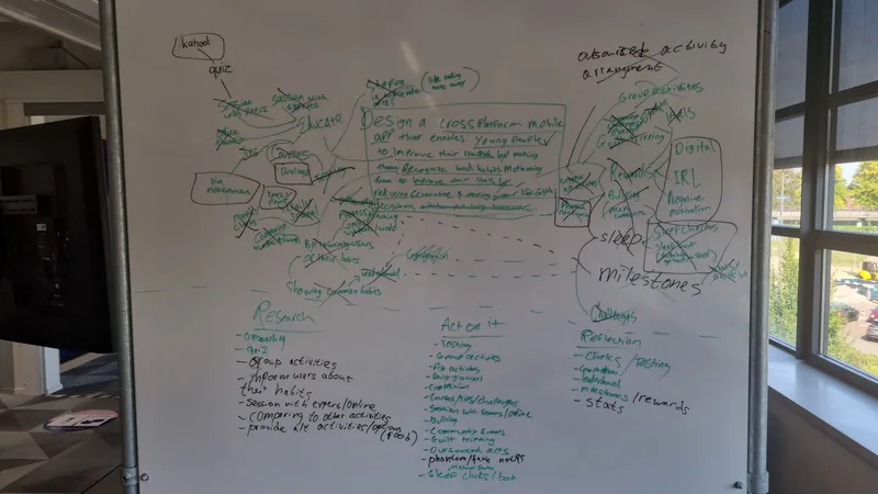
Ideation

This approach allowed us to develop our core concept, which became the cornerstone of the project. By refining our ideas based on the research question and creative brainstorming, we were able to focus on the key aspects that would best address the challenges we aimed to solve.

FitPhone ideation board

Research Conclusion

This research direction gave us a clear product goal: build an app that motivates behavior change through accountability, reflection, and community rather than just screen-time tracking.

These findings shaped the requirements for FitPhone and gave the next phase a clear focus: deciding which features would make that support practical, motivating, and useful in daily life.

Requirements

From the research, we defined the central product goal: help users become more intentional with their phone use while building a sense of community and accountability. The app needed to feel motivating, not restrictive, and should support real-world behavior change rather than just data tracking.

Client Feedback & User Research

Throughout the development of FitPhone, we held biweekly meetings with our client, which provided consistent opportunities for feedback and collaboration. The client also engaged minor students and target audience members, allowing us to gather diverse perspectives. These sessions encouraged innovative ideas like integrating habit reflection, screentime reduction strategies, and personalized activity tracking.

MoSCoW Prioritization

The proposed feature set, guided by the MoSCoW analysis, ensured FitPhone focused on essential functionalities like matchmaking and meeting management while integrating enhancements to boost user engagement. By prioritizing core features and leaving space for future growth, the app was well-positioned to meet user needs effectively and adapt to evolving feedback.

Loading PDF...
Page 1 of 1
Page 1

Agile Process

FitPhone was developed through an iterative Agile process rather than one fixed sequence of handoffs. We moved between research, requirements, prototyping, testing, and implementation in short feedback cycles, using each round of learning to improve the next version.

Agile was useful because it kept the team close to the client and target users while the product was still changing. Our biweekly client meetings, user feedback sessions, and MoSCoW prioritization helped us decide what to build next, respond to new information, and avoid spending time on features that did not support the core goal.

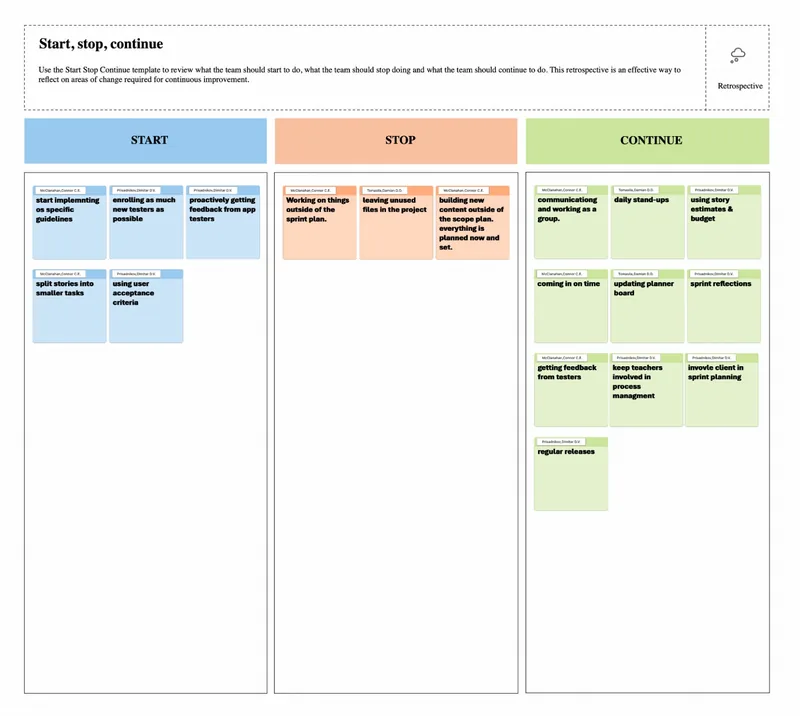
Agile Retrospective

At the end of each cycle, the team reflected on what was working, what was creating friction, and what we wanted to carry into the next sprint. This made the process more intentional and gave us a practical way to improve our collaboration as well as the product.

FitPhone Agile Start Stop Continue retrospective

Start

  • Work from clear implementation guidelines.
  • Bring in more testers and gather feedback earlier.
  • Use smaller stories and clear acceptance criteria.

Stop

  • Working on tasks outside the sprint plan.
  • Leaving unused files and unfinished work in the project.
  • Building content outside the agreed scope.

Continue

  • Communicating openly and working as a group.
  • Using stand-ups, sprint reflections, and a shared planning board.
  • Getting regular feedback from testers and keeping the client involved in planning.
  • Releasing and reviewing improvements regularly.

Key Feedback Timeline

Requirements Conclusion

The requirements phase clarified which features mattered most and which ideas were nice-to-haves. We prioritized goals, reflection, accountability, and useful activities instead of trying to build every possible feature at once.

Using Agile cycles made that prioritization practical: the team could test a focused direction, learn from feedback, and adjust before moving further into development. This gave us a stronger foundation for prototyping an experience that could be tested with real users.

Design & Testing

We translated the requirements into a clear app flow: onboarding to define goals, a home screen for visibility and tasks, activities and education to encourage action, and reflections to drive awareness over time. These screens were iterated through sketches, design reviews, and feedback sessions with the client and target users.

The most important learning was that the product needed to feel like a support system, not a punishment tool. This led to a lighter, more encouraging experience with visual progress, activity recommendations, and social accountability built into the core flow.

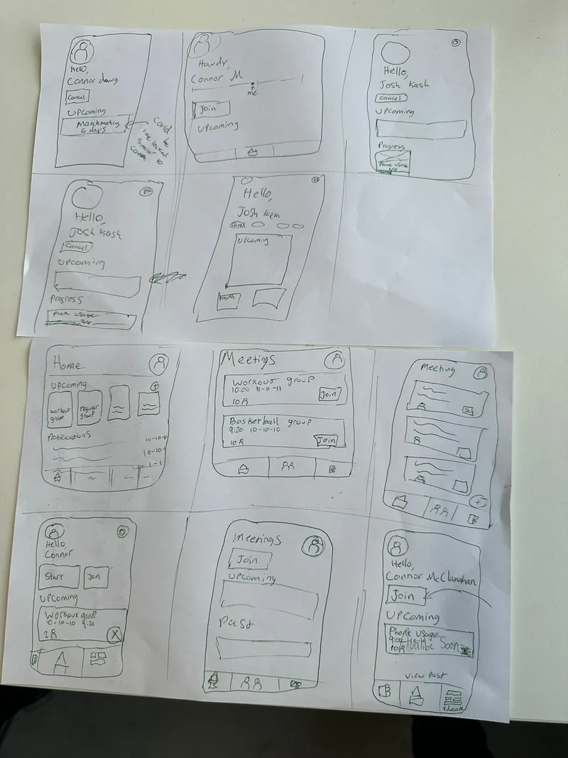
Low-fidelity Sketches

Initial sketches focused on core functionalities like matchmaking and education, helping the team test the structure before investing in high-fidelity design.

FitPhone low-fidelity sketches

High-fidelity Prototype

Refinements included polished UI elements and interactive features like meeting flows, home activity cards, and more consistent visual language.

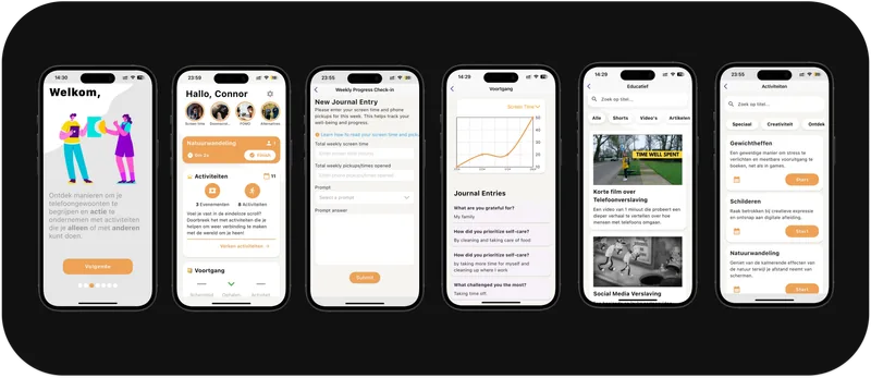
Final Design

FitPhone final design screen collage

Design & Testing Conclusion

The prototype testing showed that the strongest version of FitPhone was one that felt supportive and motivating, not restrictive. The final design made progress visible while encouraging users to take manageable steps.

These learnings translated directly into the implementation decisions, giving us a tested direction for building the product rather than simply handing development an unvalidated set of screens.

Implementation

The final app was built in Flutter to produce a polished, responsive prototype that could communicate the core user flow and product direction clearly. The implementation focused on a user-friendly experience that supported habits, peer accountability, and educational engagement without feeling overly heavy or intrusive.

We also used ongoing client feedback to refine the design and simplify the product scope. Rather than adding unnecessary complexity, we focused on the features that best supported the app's purpose: progress tracking, reflection, activities, and community-driven motivation.

Core Screens

Onboarding helped users define the challenges they wanted to solve; the home screen displayed progress and personalized activities; the education and activities sections offered practical support; and the journal and stats screens reinforced reflection and habit tracking.

Improvements

During user testing and feedback sessions, we decided against a full login system and instead used local storage to respect user privacy while simplifying the experience. We also refined the design based on what we learned while building and iterating through each step, making the final product more professional and aligned with the initial high-fidelity concept.

Implementation Demo

This short demo shows the implemented FitPhone experience and how the core flow comes together in the built product.

Implementation Conclusion

The final implementation brought together the project's core lessons: clarity, accountability, and habit support mattered more than adding more tracking features.

FitPhone's value came from helping users build healthier habits in a way that felt encouraging, personal, and sustainable. The final product reflects the full process from research and requirements through design, testing, and development.