Research Approach
I used a mixed-methods research approach to understand the gap between Diplora's capable ECG hardware and the experience of using it at home. The research had to answer two connected questions: what do older adults need in order to feel confident using a monitoring device, and what can the patient-facing app communicate without crossing into diagnosis?
I combined literature review, competitor analysis, stakeholder interviews, patient interviews, survey analysis, and internal design feedback. Using these methods together helped me compare formal accessibility requirements with real user behavior, then turn both into concrete priorities for onboarding, status feedback, pairing, help, and symptom logging.
Key Findings
- Patients needed reassurance, not data: Users cared less about graphs and more about simple answers—is it working, are readings being recorded, and what should I do if something goes wrong?
- Accessibility barriers were critical: 54% of survey respondents found health apps too complicated, and 14% of users aged 46+ struggled with small text. This forced WCAG 2.1 AA compliance (18pt minimum text, 4.5:1 contrast, 44x44px touch targets).
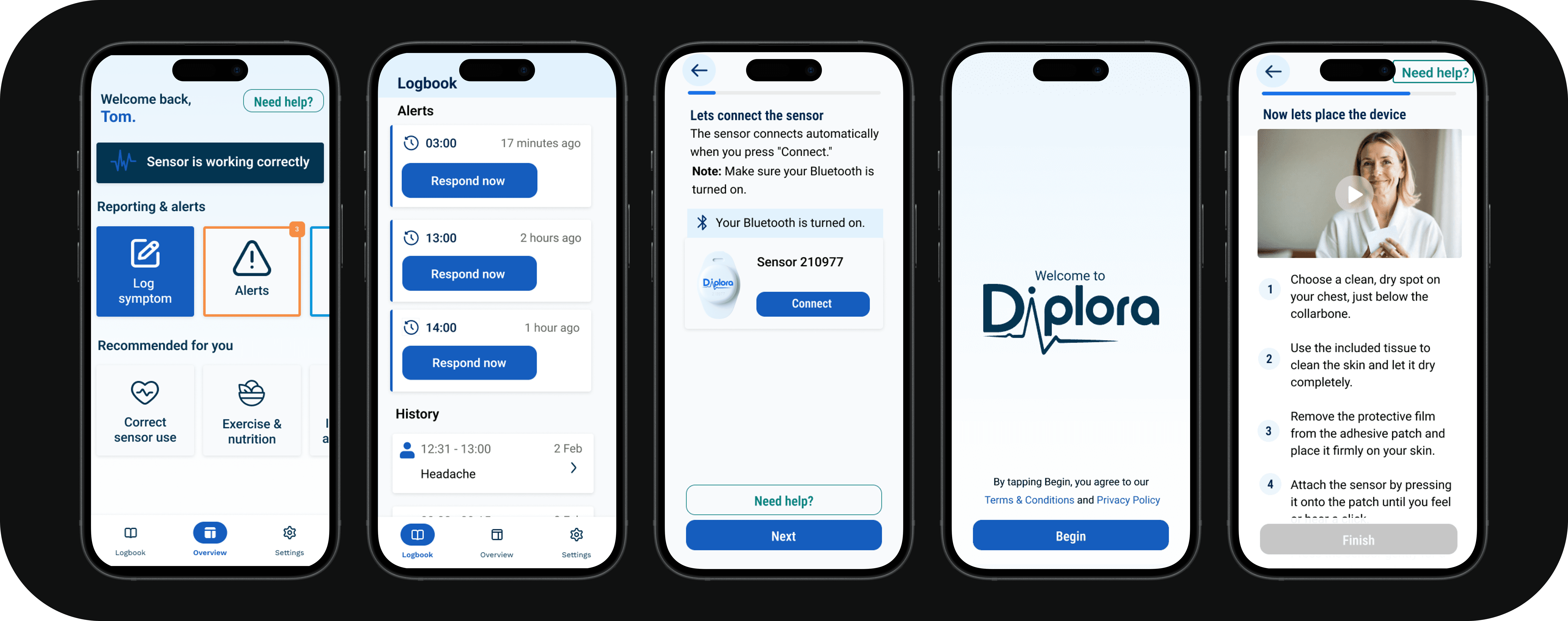
- Visual guidance was preferred: 66% of users wanted video demonstrations, followed by step-by-step pictures at 56%. This directly changed the onboarding flow from text-heavy to visual-first.
- Clear status feedback was non-negotiable: 70% of users wanted clear confirmation that their device was working. This led to the persistent status bar showing battery, connection, and recording state at all times.
Research Overview
The project focused on an accessible ECG companion app for elderly cardiovascular patients. The app was not intended to interpret ECG results for patients. Its role was to make the monitoring process understandable by showing device status, connection, battery, recording state, and clear next steps when something needed attention.
Main research question: How can an elderly-accessible ECG interface address barriers such as font size, contrast, touch targets, and cognitive load while meeting medical-device requirements?
Literature Review
I reviewed WCAG 2.1 AA guidance, research into older adult interfaces, and medical-device requirements before making design decisions. The review focused on the barriers most likely to affect cardiovascular patients at home: presbyopia, reduced contrast sensitivity, slower touch interactions, and varying levels of digital confidence.
These findings became practical design rules rather than background theory. They supported larger text, strong contrast, simple language, and touch targets of at least 44 by 44 pixels. The review also clarified the product boundary: the app should communicate device status, battery, and connection, while diagnostic interpretation remains with healthcare professionals.
Stakeholder Interviews
I spoke with cardiologists, GPs, and company stakeholders about the clinical and technical requirements behind the interface. We discussed the value of longer monitoring periods, leads detaching, movement affecting signal quality, and the importance of accurate sensor placement.
The interviews defined what the patient-facing app should and should not do. It needed to confirm whether the device was connected, recording, and working, while reports and diagnostic interpretation remained with specialists. That boundary shaped the status bar, onboarding language, placement guidance, and alerts.
Patient Interviews
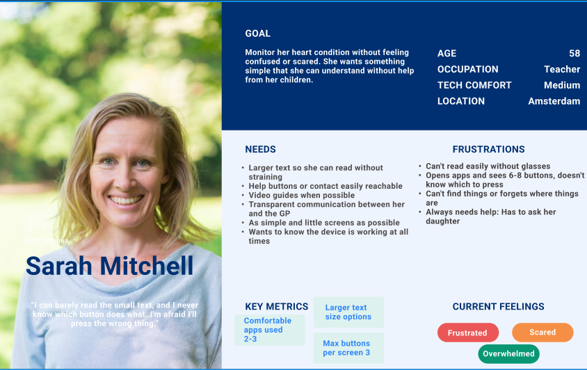
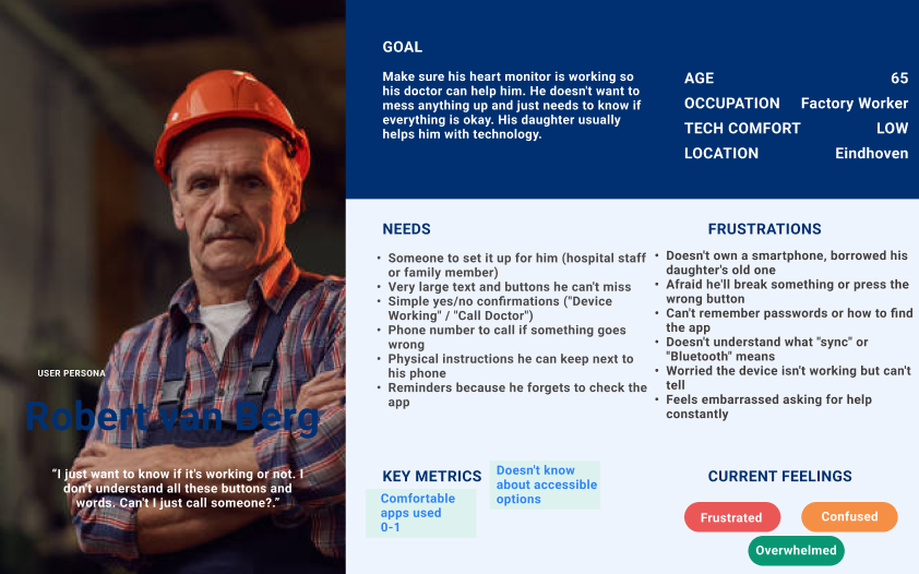
I conducted in-depth interviews with elderly Holter monitor users aged 70 and above to understand what monitoring felt like at home. Participants described physical discomfort, anxiety about whether the device had stopped working, and confusion caused by technical information.
Their needs were more direct than the existing interface suggested. They were less interested in graphs than in simple answers: is it working, are readings being recorded, and what should I do if something goes wrong? This shifted the design toward reassurance, large text, simple navigation, visual guidance, and clear next steps.
Survey Analysis
I ran a quantitative survey with 50 respondents aged 18 to 75 and above to test whether the interview themes appeared at a broader scale. The survey measured perceived complexity, readability, confidence in device status, and preferred ways of learning how to use a monitoring device.
The strongest findings were that 54% found health apps too complicated, 14% of respondents aged 46 and above struggled with small text, and 70% wanted clear confirmation that their device was working. Video demonstrations were preferred by 66% of respondents, followed by step-by-step pictures at 56%. These results turned reassurance, visual guidance, and simplified navigation into evidence-based priorities.
Internal Feedback
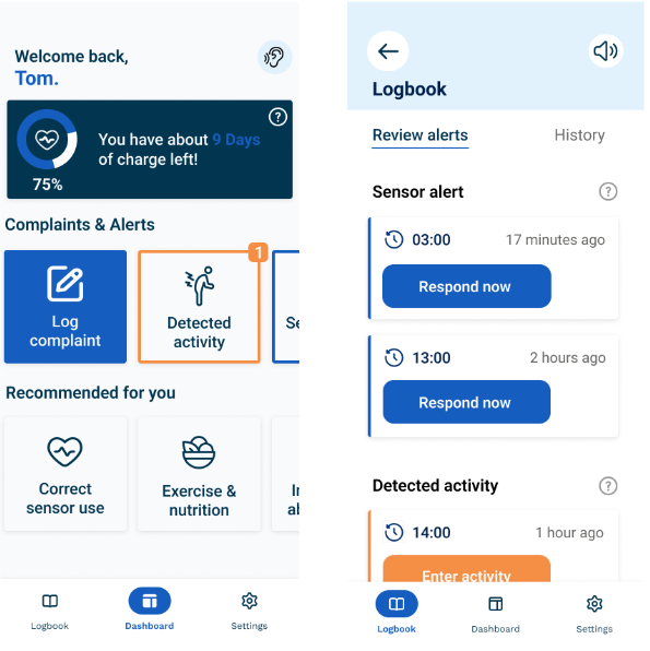
I reviewed the existing Figma designs with Diplora stakeholders before moving into prototyping. This exposed small default text, inconsistent visual language, unclear status communication, and an onboarding flow that asked users to process too much information.
I used that feedback to refine the visual direction and simplify the highest-risk flows. It also helped define the MVP around accessible onboarding, a persistent status bar, device pairing, help, emergency contact access, and focused symptom logging.