As a UX/UI Designer and Front-end Developer, I designed and developed an accessible ECG mobile application interface for Diplora's mHealth platform, serving both healthcare professionals requiring diagnostic data and elderly patients (65+) needing simple device status confirmation.
Diplora's mHealth ECG platform needed an accessible front-end for elderly cardiovascular patients. The challenge: design an interface that serves two distinct user groups—healthcare professionals needing diagnostic accuracy and elderly patients aged 65+ needing simple reassurance that their device is working correctly.
The project addressed critical accessibility barriers including presbyopia (age-related farsightedness), reduced contrast sensitivity, slower touch interactions, and varying digital literacy levels. Through extensive user research, I identified that elderly patients prioritize reassurance and simplicity over comprehensive medical data.
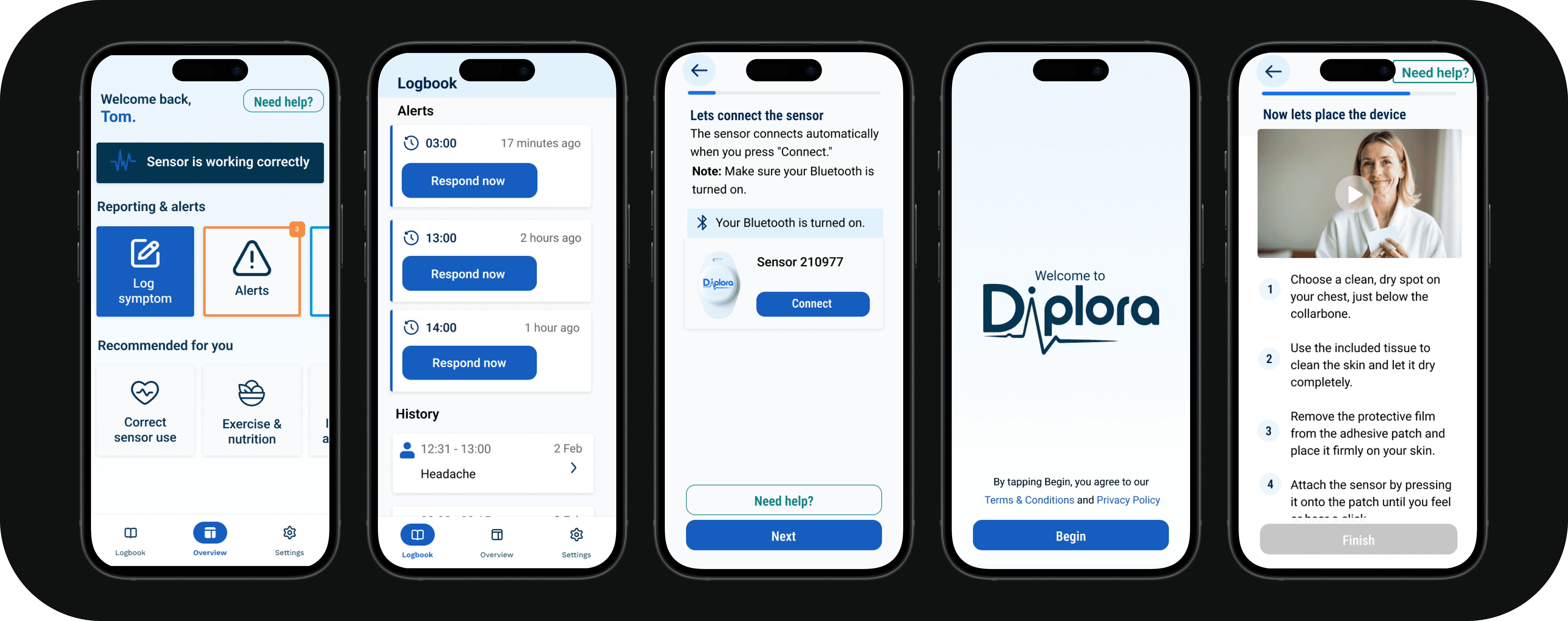
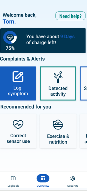
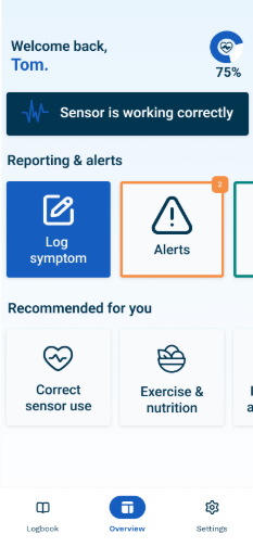
The result is a Flutter MVP that implements WCAG 2.1 AA accessibility standards, features real-time Bluetooth connectivity with ECG sensors, and provides the persistent "Device Working" confirmation that 70% of surveyed elderly users explicitly requested.
The project used a hybrid Waterfall-Agile approach, starting with structured research and planning, then shifting to Agile during design validation and development. This allowed for comprehensive upfront research while maintaining flexibility for user-centered iteration.
Research revealed critical barriers preventing elderly users from engaging with health monitoring apps. The findings directly informed all design decisions.
Built Diplora's visual identity and established accessibility-first design standards as the foundation for all interface decisions.
Using the MOSCOW method, I prioritized features based on accessibility and clinical validation requirements. Must-have features address the core needs identified in research.
Conducted comprehensive mixed-methods research to understand both clinical requirements and elderly user needs. The research phase produced detailed documentation that informed all subsequent design and development decisions.
Comprehensive review of WCAG 2.1 AA standards, elderly UX research, and medical device regulations to establish accessibility requirements and compliance frameworks.
Evaluated 6 device-connected health apps (AliveCor, myPhonak, Garmin, Omron, Apple Health, FreeStyle) to identify accessibility gaps and opportunities.
Interviewed cardiologists and GPs to gather clinical requirements, understand device limitations, and validate that the app shows device status only (never diagnostic information).
Conducted in-depth interviews with elderly Holter monitor users (70+) to understand real-world pain points, anxieties, and what actually builds confidence with monitoring devices.
Quantitative survey with 50 respondents aged 18-75+ on health app usability, revealing that 54% find apps too complicated and 70% want "Device Working" confirmation.
Reviewed existing Figma designs with Diplora stakeholders to validate design direction and gather feedback from the company team before prototyping.
Evaluated 6 device-connected health apps (AliveCor, myPhonak, Garmin, Omron, Apple Health, FreeStyle) to identify accessibility gaps and opportunities.
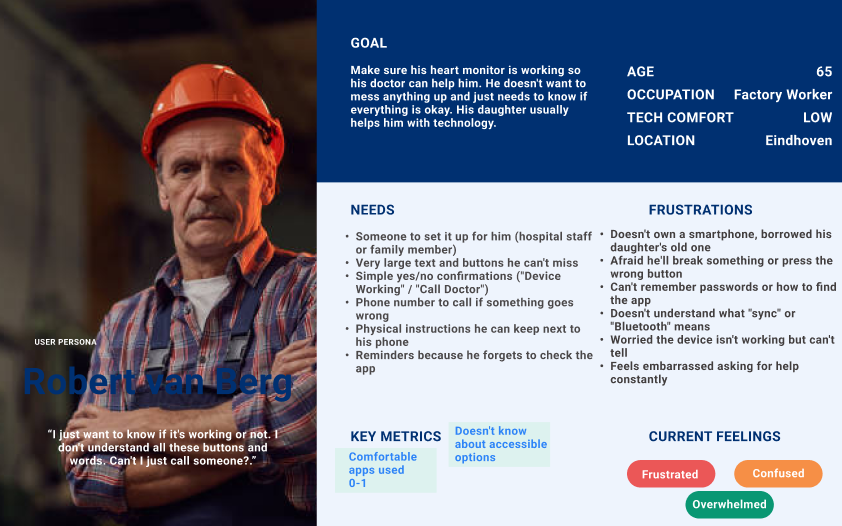
Two primary user personas informed the design, representing the distinct needs of elderly patients and their healthcare providers.
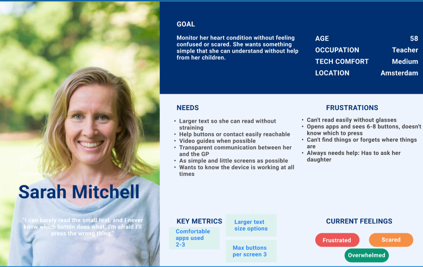
Represents elderly patients aged 65+ who prioritize device reassurance and simple operation over comprehensive medical data.
Healthcare professionals and caregivers who need diagnostic data access while ensuring elderly users have simplified, reassuring experiences.
Conducted iterative user testing with elderly users (ages 56-70+) to validate accessibility-first design patterns. Six major design iterations addressed user feedback and expert recommendations.
The design underwent six major iterations based on combined feedback from user testing, expert review, and internal stakeholder input. Each iteration was informed by real user behavior and expert guidance.
Issue: Test users confused by "Add Complaint"—Faye thought it meant complaining about the sensor itself
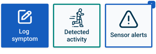
Change: Renamed to "Log Symptom" throughout the interface; "Detected Activity" → "Activity History"
Impact: Users immediately understood each button's purpose
Issue: Placeholder icons didn't clearly indicate function; confusing for elderly users
Change: Replaced unclear icons with standard health app iconography; added text labels to all navigation items
Impact: Functions became immediately recognizable
Issue: Mildred couldn't find instructions when needed; Ben requested "easy Help button"
Change: Added visible "Help" button to main navigation, always accessible from home screen
Impact: Users can access instructions at any point without navigating through settings
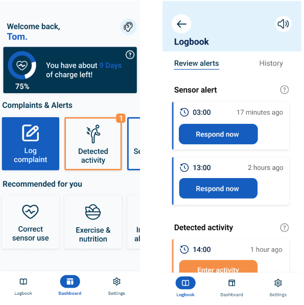
Issue: Large battery indicator took significant space; Mildred said "It's too big"
Change: Reduced battery to small status indicator in persistent status bar; only draws attention when charging threshold reached
Impact: Refocused home screen hierarchy on actionable items, reduced visual clutter
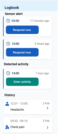
Issue: Separate tabs for "Review Alerts" and "History" with filtering options was overcomplicated
Change: Combined into single unified list; actionable items emphasized, removed unnecessary filtering
Impact: Cleaner, less technical interface that's easier to navigate
Designed high-fidelity prototypes based on feedback from low-fidelity testing. These detailed, interactive prototypes incorporated refined design elements and enhanced functionality, providing an accurate representation of the final product ready for user validation.
Built a fully functional Flutter MVP with Bluetooth Low Energy connectivity, working symptom logbook, and movement simulation system. All code follows accessibility standards and uses scalable architecture patterns.
Connect to Supabase for real-time alert synchronization with healthcare providers.
Integrate movement matrix for real movement detection instead of simulation.
Implement robust placement identification algorithms with improved 3D guidance.
Create professional setup video—users requested tutorials (66%).
Add Dutch and other language options for broader accessibility.
Add interactive tooltips for first-time user guidance.
54% found apps too complicated. One core function done well beats many done poorly.
Paper prototypes caught major issues early. Actual behavior differs from stated preferences.
Domain experts provided invaluable perspectives that improved the product measurably.
Waterfall research + Agile development maintained project cohesion.
Understanding both disciplines ensures feasible designs and user-centered implementations.
Device status only became an advantage—the interface stayed focused on patient needs.